Thursday, October 25, 2012

Font Test - 1

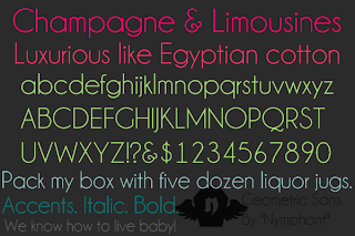
Testing out my preferred of the fonts from my first group of chosen fonts. You don't really know what it'll look like until it's composed with the rest of the magazine cover, but there's nothing wrong with getting a feel of what my title will look like in the different fonts.

^ Ambrosia ^

^ Champagne & Limousines ^

^ Code ^

^ Code Light ^

^ Glasket ^

I'll probably look for and test more of them later on over the weekend. Especially considering I actually like the fonts and can use them in personal projects.

My main concern is how to incorporate the word Diabetes into the selections. Do I want it to be offset like I sketched out, or should it flow with the rest of the masthead?

Also need to think of sell lines since I'm going with the whole "giant picture cover story" thing.

Magazine Cover Fonts


My collection of font ideas so far for my masthead.

I think with the direction I have in mind a simple font masthead in a clean cut sans serif or very understated serif would work best. Especially considering that I want the magazine to look on the cutting edge without the sterility of a hospital. And I definitely want to stay away from the idea of it being a homey cook book/ food magazine.

After reviewing the idea with my professor, I decided that his assessment of it being a purely diabetic nutritional and informative magazine aside from something niched into a series worked out better. Especially with the point of it being a large concern in the country and such a prevalent disease.

I only have one Serif and one Handwritten font in the mix, mostly for the tone they provided, but I doubt I'll use them.

I'm really leaning heavily towards CODE, Champagne & Limousines, Ambrosia and Glasket.

We'll see what else I can find.

Magazine Cover Sketches


These are the sketched cover ideas for my magazine entitled Food Beyond. 

They're very basic as I don't like investing too much time into something I may not use. If I choose to use one of these, I'll supply a more detailed sketch.

The title for the magazine cover is a play on the words "Life Beyond", like where there are magazines and informational pamphlets for "Life Beyond Cancer" or "Life Beyond Parkinson's". I figured why not have one related to diseases that effect what you eat.

It's a pretty simple idea. Your ability to indulge in all sorts of foods doesn't end just because you have diabetes or celiacs or whatnot.


These were sketches I did last class in relation to cover images. Everyone was using the tablets and there wasn't enough for us all, so since I have a lot of experience using one I just decided to let everyone else play around with them.


Tuesday, October 23, 2012

Magazine Cover Layout v.0


This is a mock-up of my idea for my nutritional food magazine cover. This is only a placement mock-up. Item indicators are subject to change along the way and the fonts used in this mock-up are not what I will be using in future drafts. 

Magazine Cover Mood Board


This is the mood board for my magazine cove project. It's mostly food, statistics, medication and colors for the piece. I'm still torn on what I'm going to use in terms of fonts. I really need to look for some.

Magazine Cover Questions

The following are questions in which we had to answer as part of our brainstorming process for out Magazine Cover:

Who is the target audience?

  • My target audience will be diabetic foodies. As someone who is diabetic and a foodie, I understand the degree of difficulty that is presented when one has a palette for all sorts of food but has to keep their condition in mind as to what they can and cannot eats, as well as the quantities. This also ties in with the nutrition theme I've picked as it can be very difficult for a diabetic to ingest the nutrients they require on a daily basis when having certain things limited to them.
What is the name of your magazine? Why? Connotations?

  • I like the name Food Beyond. It gives the impression that, like with many diseases, diabetes isn't the end of the road in terms of the particular journey you're on. In this case that journey would be food. It could also imply that it is possibly a part of a small series of publications in which they focus primarily on what one can do with themselves after being diagnose with certain diseases, for example Celiac, which is a disease that gives you a very adverse reaction to eating things like gluten. An example of how this would work would be something like; Food Beyond: Diabetes, or Food Beyond: Celiac.
What will your masthead look like? Do you have any ideas for fonts?

  • I do not know what I'm going to have my masthead look like at this time, or what fonts I'm going to use. It's something I'm struggling with at the moment as I could go many different directions with the idea of a nutritional food magazine without making it look sterile and hospital-like.
What images will be on your cover and why?

  • Food related imagery, prescription medications and diabetic tools are some of the mages I am thinking of incorporating. One of the biggest concerns for diabetics depending on their type is how their insulin or pills will react with their food and effect their blood sugar, so nutritionally they're very interconnected.
What will be your sell lines to entice your target audience?

  • Not quite sure on this one either. A food magazine for diabetics tends to sell itself most often, but probably lines that talk about being able to indulge in foods you love without spiking your blood sugar and those sort of things.

Collaborative Mind Map


This is the Mind Map that three other students and myself created as part of a group exercise orchestrated by my professor. At the end, the students in the other groups looked at our Mind Maps and picked out two things that stood out to them and we were to use them as choices for the basis of our next big project. Our group had PETA and Nutrition picked for them.

We're doing Magazine Covers.

I'm going to do a Nutrition magazine instead of PETA even though I know quite a bit about PETA. Mostly because I don't feel like being angry throughout this entire project.

Wednesday, October 17, 2012

Ad Insertion Exercise


The exercise called for us taking a picture of ourselves and superimposing ourselves into the ad as well as bringing the ad into InDesign then to place text over top of it in order to tie the piece together. I like cats, so I picked the Iams ad. I also picked it because it allowed me to look ridiculous.

Tuesday, October 16, 2012

Types of Images Project :: Finished


This is the finished product for our introduction to Photoshop and InDesign project where we had to recreate a table our professor had constructed in InDesign using an 8.5" x 11" formated page. We were instructed to recreate it to the best of our abilities using the tools provided by Photoshop and InDesign. There was a small amount of Illustrator practice also included in this exercise. 

Types of Images :: Pieces

The individual images that went into making the chart for the Types of Images assignment. All done in photoshop save for the illustrator screenshot, and all present except for the illustration as I forgot to upload the file.


^ Bitmap Image ^


^ Grayscale Image ^


^ Blue Image ^


^ Cyan Image ^


^ Duotone Image ^


^ Green Image ^


^ Magenta Image ^


^ Monotone Image ^


^ Illustrator Screencap ^


^ Red Image ^


^ Yellow Image ^

Thursday, October 4, 2012


My mounted seed packet project along with my constructed front and back seed packet. Critique went well and I anticipate a decent grade on this. I should have really taken my last seed packet to the black board before mounting it though, it ended up being darker looking despite having bumped up the contrast greatly.

Tuesday, October 2, 2012

Seed Packets :: Final Designs


These are the final designs for my seed packets.

Class critique yielded agreement to some of the color problems I speculated and the teacher vocalized upon earlier in class. I also made some minor tweaks to the plants themselves, adding another Cattail, and brightening up the highlights on the Petunias. 

The rest of the comments were either compliments on the design, or questions in regards to the direction in which I can't answer specifically because I was only able to create one specific back.

If anyone specifically from class is reading though; Yes. The flowers give you the emotion. My thoughts behind it was in regards to those awkward moments when you either want to miraculously feel better, or be able to relate to a certain situation and just can't seem to get yourself to do so.

Onto the fronts and back: