


My collection of font ideas so far for my masthead.
I think with the direction I have in mind a simple font masthead in a clean cut sans serif or very understated serif would work best. Especially considering that I want the magazine to look on the cutting edge without the sterility of a hospital. And I definitely want to stay away from the idea of it being a homey cook book/ food magazine.
After reviewing the idea with my professor, I decided that his assessment of it being a purely diabetic nutritional and informative magazine aside from something niched into a series worked out better. Especially with the point of it being a large concern in the country and such a prevalent disease.
I only have one Serif and one Handwritten font in the mix, mostly for the tone they provided, but I doubt I'll use them.
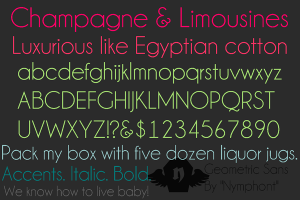
I'm really leaning heavily towards CODE, Champagne & Limousines, Ambrosia and Glasket.
We'll see what else I can find.
No comments:
Post a Comment